Introduction: Why Email Newsletter Design Can Make or Break Your Results
Your email newsletter might have great content…
but if the design is poor, most people will never read it.
In today’s crowded inbox, readers don’t just judge your message — they judge how it looks, how easy it is to scan, and how quickly they can understand what you’re offering.
That’s why email newsletter design is one of the most important (and most overlooked) parts of email marketing success.
A well-designed newsletter helps you:
- Grab attention instantly
- Make your content easier to read
- Keep people scrolling instead of closing
- Increase clicks, conversions, and trust
On the other hand, a cluttered layout, bad color choices, or hard-to-read text can kill engagement — even if your message is valuable.
In this guide, you’ll discover proven email newsletter design tips for:
- Layout and structure
- Color selection
- Typography and spacing
- Mobile-friendly formatting
- High-converting call-to-action design
Whether you’re a beginner or growing an online business, these best practices will help you create beautiful, professional, and high-converting email newsletters that people actually enjoy reading.
Let’s start with why design matters more than you think.
1. Why Email Newsletter Design Matters
Good design isn’t decoration — it guides attention, improves readability, and increases clicks.
Your readers don’t “read” emails the way they read blog posts. They scan them. That means your layout, colors, images, and call-to-action buttons must work together to guide the eye toward the most important parts of your message.
When your email newsletter design is done right, it helps you:
- Keep readers engaged
- Highlight key points quickly
- Increase click-through rates
- Make your brand look professional and trustworthy
According to a study by HubSpot, well-structured email design significantly improves engagement and click rates. You can explore their research here:
👉 https://blog.hubspot.com/marketing/email-design-tips
In short: your design isn’t just about looking good — it’s about making people act.
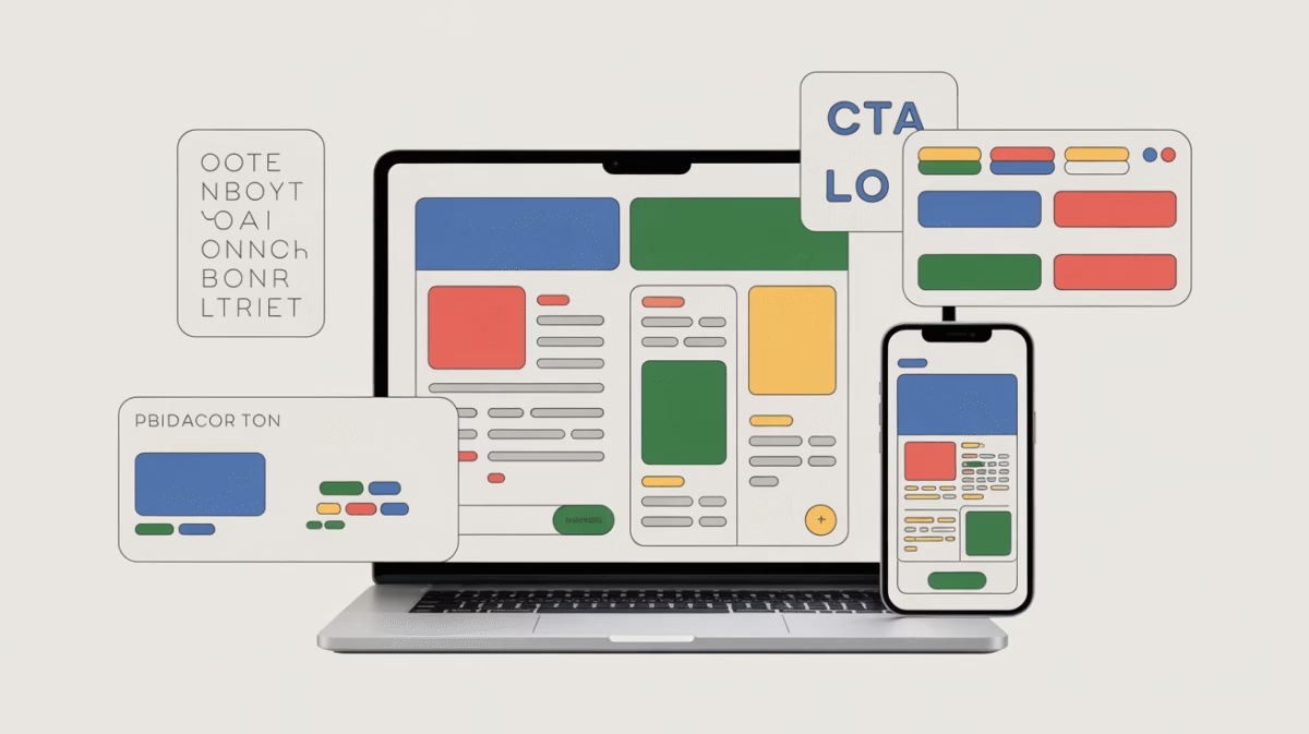
2. Start with the right layout: the Inverted Pyramid (TOC → CTA)
Use the inverted-pyramid layout: most important content at the top, supporting details in the middle, and the CTA near the top and repeated at the end. Campaign Monitor explains this model and why it’s effective for newsletters. (Campaign Monitor)
Practical layout (mobile-first):
- Top: Preheader + strong subject line visible in inbox
- Above the fold: Headline + 1-line value proposition + primary CTA (button)
- Middle: 1–3 content blocks (image or illustration + short paragraph + micro-CTA)
- Bottom: Social proof / testimonials + secondary CTA + footer (unsubscribe + links)
Copyable headline + subhead template
- Headline: “3 Quick Wins to [Benefit] in 7 Days”
- Subhead: “Simple steps you can use today to [specific outcome].”
Checklist:
- Single-column layout for mobile
- One primary CTA visible without scrolling on mobile
- Secondary CTA at the bottom for late deciders
3. Pick a color system that converts (brand + contrast)
Colors set tone and guide action. Use:
- 1 primary brand color (for identity + links)
- 1–2 accent colors (for CTAs, highlights)
- Neutral background (white or off-white) for readability
Accessibility & contrast
- Follow WCAG contrast guidance: aim for at least 4.5:1 (normal text) and 3:1 (large text/non-text UI) to be accessible. This improves readability for low-vision users. (W3C)
Practical color rules
- CTA color = high contrast vs background (use contrast checker)
- Use accent color sparingly — it’s more powerful when rare
- Avoid red/green as your only differentiator (colorblindness)
Simple test: If a CTA looks subdued on a grayscale view, increase contrast.
4. Use White Space Strategically
White space = breathing room. And in email design, breathing room equals higher engagement.
Instead of squeezing all your content together, white space allows your layout to “breathe,” making every element easier to notice, scan, and understand.
When your content feels crowded, readers feel overwhelmed — and overwhelmed readers click “close.”
But when there’s space between elements, your message becomes calm, clear, and inviting.
Here’s how to apply white space the right way in your email newsletters:
- Add 16–24px of padding around text blocks (especially on mobile)
- Separate sections with visible spacing
- Let your call-to-action (CTA) button sit alone inside a small block of empty space
Why this works:
White space improves visual scanning, reduces cognitive load, and makes your CTA stand out — which directly increases click-through rates.
In other words, space isn’t wasted space. It’s a conversion tool.
5. Typography: Choose Readable, Email-Safe Fonts
Once your spacing is right, your font choices become the next critical layer of email newsletter design.
Email clients are very strict about which fonts they support. If you choose fancy or unsupported fonts, your email can break, look unprofessional, or become hard to read.
That’s why it’s best to stick with email-safe fonts or carefully tested web fonts.
The team at Litmus explains the trade-offs between web-safe fonts and custom fonts here:
👉 https://www.litmus.com/blog/web-fonts-vs-web-safe-fonts/
Best typography practices for email newsletters
To keep your emails clean, readable, and professional, follow these guidelines:
- Body text size: 16px (perfect for both desktop and mobile)
- Headline size: 20–28px, based on hierarchy
- Ideal line length: 45–75 characters per line
- Limit font families:
- 1 font for headings
- 1 font for body text (or use one consistent font everywhere)
- Use bold text sparingly to highlight key anchors
Recommended font stack example
font-family: "Arial", "Helvetica", sans-serif;
Good typography quietly guides the reader — it doesn’t distract them. The easier it is to read, the longer people stay.
6. Images: Use Them — But Optimize Them
Images are powerful. They grab attention, create emotion, and help communicate your message quickly.
However, poorly optimized images can slow down load times, break layouts, and frustrate readers — especially on mobile devices.
That’s why smart email designers balance beauty with performance.
Image best practices for email newsletters
Follow these rules to keep your emails both attractive and fast:
- Use one clear hero image or illustration per main email section
- Avoid cluttering emails with too many images
- Compress images before uploading using tools like:
- TinyPNG → https://tinypng.com
- ImageOptim → https://imageoptim.com
- Always add descriptive alt text (this helps when images are blocked by email clients)
- Never rely on images to carry critical information — some clients block images by default
Where to source high-quality images
You can find beautiful, royalty-free images on:
- Unsplash → https://unsplash.com
- Pexels → https://www.pexels.com
The importance of proper image alt text and accessibility is also explained in detail by WIRED:
👉 https://www.wired.com/story/how-to-write-alt-text-accessibility/
✨ At this point, your email layout has breathing room, readable fonts, and optimized visuals — which means your emails are now easier to love and easier to click.
7. CTA design: single, visible, irresistible
Conversion research (Optimizely/VWO experiments) shows simpler CTA strategy converts better: one primary, visually distinct CTA is often best. (Optimizely)
CTA checklist
- Button color: high contrast and brand-aligned
- Button text: 2–5 words, benefit-driven (“Get the Guide”, “Start Free Trial”)
- Make buttons large and tappable on mobile (min 44x44px)
- Place CTA above the fold and repeat at the end
Copy formulas
- Benefit → Action: “Get [result]” → “Get the 7-day plan”
- Urgency (real): “Claim your spot — 24 hours left”
8. Preheader & Subject Line: Design the Inbox Experience
Your email doesn’t start inside the email — it starts in the inbox.
The subject line is your primary headline, and the preheader text is your second chance to hook attention. When used together, they form a powerful “preview duo” that determines whether your email gets opened… or ignored.
Think of the preheader as a supporting actor for the subject line:
- It can add urgency
- Provide extra context
- Or tease the benefit inside the email
According to HubSpot’s research on inbox behavior and preview text optimization, smart use of preheaders can significantly increase open rates:
👉 https://blog.hubspot.com/marketing/email-preview-text-tips
Inbox-ready structure
For best results, stick to this proven length formula:
- Subject line: 35–60 characters
- Preheader text: 40–90 characters
Example (high-performing combo)
Subject: “3 subject lines that actually work”
Preheader: “Try these today — higher opens guaranteed”
This combination builds curiosity and sets a clear promise before the email is even opened.
9. Make Emails Skimmable: Hierarchy & Microcopy
Most people don’t read emails word for word — they scan.
That’s why you need a strong visual hierarchy that guides the eye and helps readers find value in seconds.
Use this proven content structure:
- H1 headline → grabs attention
- H2 subheads → guide scanning
- Short paragraphs → improve readability
- Bulleted lists → simplify information
- Clear CTA button → direct action
Skimmable flow formula
Headline → 1-line benefit → image or bullets → CTA
Additional microcopy best practices:
- Use bold text to highlight the most important sentence in each section
- Add thin visual dividers (horizontal lines) to separate content blocks
- Keep paragraphs to 2–3 lines max
The easier your email is to scan, the more likely readers will stay, scroll, and click.
10. Mobile-First Rules (Must-Follow)
Most email opens happen on phones — and this isn’t optional anymore.
Litmus email industry research consistently shows that a huge percentage of readers open emails on mobile devices:
👉 https://www.litmus.com/resources/email-marketing-stats/
That means you must design for small screens first, not last.
Mobile-first email design checklist
- Use a single-column layout
- Make buttons full-width or large enough to tap easily
- Keep body font size 16px or higher
- Avoid tiny text links — use buttons for key CTAs
- Test your emails on major clients:
- Gmail
- Apple Mail
- Outlook mobile app
A mobile email should feel smooth, clickable, and frustration-free.
11. Accessibility Checklist (WCAG-Friendly)
Great email design isn’t just beautiful — it’s inclusive.
Accessible emails reach more people, improve user experience, and align with global web standards.
Follow these accessibility best practices inspired by WCAG guidelines from the W3C:
👉 https://www.w3.org/WAI/standards-guidelines/wcag/
Accessibility must-haves
- Maintain a contrast ratio of 4.5:1 or higher for body text
- Add meaningful alt text for all images
- Use semantic HTML wherever possible
- Never rely on color alone to convey meaning — also use text labels
- Make sure links and buttons contain descriptive text (not “click here”)
Accessibility isn’t a limitation — it’s a growth advantage.
✅ At this stage, your email newsletter design is optimized for inbox performance, scanning behavior, mobile usability, and accessibility.
12. Testing & QA (what to test before sending)
- Inbox rendering (Gmail web, Gmail app, Apple Mail, Outlook)
- Link & button clicks
- Image loading & alt text
- Mobile vs desktop scroll behavior
- Load time (optimize images)
- Spam score & deliverability basics (subject lines, sender domain authentication)
Tools to use: Litmus, Email on Acid, and Mailchimp previews. (Litmus)
13. A/B testing ideas that actually move the needle
Test one variable at a time:
- Subject line (curiosity vs clarity)
- CTA color or copy
- Hero image vs no image
- Single-column vs two-column (desktop only)
- Button vs text link CTA
Metric to track: open rate (subject), CTR (CTA), conversion rate (goal)
14. Common mistakes and fixes on Email Newsletter Design
- Mistake: Too many CTAs → Fix: Pick one primary CTA. (Optimizely)
- Mistake: Low contrast → Fix: Adjust color, check WCAG contrast. (W3C)
- Mistake: Not mobile testing → Fix: Switch to single-column + test. (Litmus)
- Mistake: Huge images → Fix: Compress + add alt text. (WIRED)
15. Tools & resources to Design Email Newsletter (quick list with links)
- HubSpot — email design best practices. (blog.hubspot.com)
- Campaign Monitor — inverted-pyramid model. (Campaign Monitor)
- W3C / WCAG — color contrast & accessibility. (W3C)
- Litmus — email client market share & testing. (Litmus)
- Mailchimp — email design tips & previews. (Mailchimp)
- Canva — templates & simple graphic design (great for non-designers). (Mailchimp)
- Unsplash / Pexels — free high-quality images. (WIRED)
16. Quick ready-to-use swipe file (copy & design)
Minimal newsletter template (single-column)
- Preheader: “Quick tip inside — 2 minutes to read”
- Headline: “How to write subject lines that get opened.”
- Body: 2 short paragraphs (≤3 lines each)
- Bullet list: 3 quick tips
- CTA Button: “Get the free subject line swipe file” (accent color)
- Footer: one-line unsubscribe + social link
Visual layout (spacing)
- Top padding 20px
- H1 font-size 22–26px
- Body 16px, line-height 1.4
- Button padding 12px 20px, border-radius 6px
17. Publication checklist (before you hit send)
- Subject + preheader tested on mobile
- CTA visible above the fold on mobile
- Images compressed + alt text added
- Contrast checked (WCAG)
- Single-column mobile layout confirmed
- Links & buttons tested
- Spam score and sender auth checked
18. Final Notes on Email Newsletter Design Tips
Strong design plays a subtle but important role in performance by boosting engagement signals such as clicks and time spent reading, while also supporting better deliverability through fewer spam complaints. When applying Email Newsletter Design Tips, focus on clarity and trust first: use honest subject lines, keep layouts easy to scan, and make sure your message matches what subscribers expect.
Beyond visuals, long-term success depends on technical and list-related best practices. Regular list hygiene, proper domain authentication, and consistent testing help ensure your campaigns land in the inbox and not the spam folder. Leading platforms like HubSpot and Mailchimp consistently highlight that Email Newsletter Design Tips work best when combined with clean data and ongoing optimization.
In the end, effective newsletters balance aesthetics, usability, and strategy. By testing designs, monitoring engagement, and refining your approach over time, you can turn Email Newsletter Design Tips into a reliable driver of higher opens, clicks, and lasting subscriber trust.
Keep Learning, Keep Growing
Here are more guides to level up your email marketing: